The 1963-64 academic year was for me eventful, even memorable. Fresh out of graduate school with my PhD, I started my first teaching job, at the University of Massachusetts in Amherst. I taught a seminar on Marcel Duchamp that fall, and later that year I was able to interview him in New York while we sat across from one another at a chessboard with pieces designed by Man Ray, who had been the subject of my doctoral dissertation. I also met and talked with celebrated vanguardist John Cage when he was invited to campus for a performance, an uncanny experience that felt, on the heels of Duchamp, as though it was destined by chance, like one of those encounters celebrated in the Dada and Surrealist handbooks I’d been studying in connection with my thesis. Then, too, I met Bob Dylan, backstage before the spring concert he delivered in the packed UMass field house where he sang Mr. Tambourine Man, which he hadn’t even recorded yet, but which we all recognized as a tour de force, totally magical, surrealist-type poem if ever there was one. And last yet at the same time foremost in this litany of personal encounters – foremost, because it bore abiding rather than ephemeral significance – I met John Goodyear, artist and art department colleague, who knew, as I would soon come to know, more than a little about Cage’s chance and Duchamp’s ambiguity and, as much as anything else, the poetics of everyday experience.
The art department at UMass comprised three art historians and six artists, a personnel roster that was totally new to me. At Princeton, where I’d earned both my undergraduate and graduate degrees, the Department of Art and Archaeology comprised only art historians. An artist-in-residence position had been created in the mid-1950s, presumably to acknowledge studio practice, but the appointment was mostly honorific, requiring the artist to teach only two pass/fail courses a year, neither of which was required in the departmental curriculum. Art making in Princeton’s ivory tower, in other words, had largely to be imagined, like a virtual reality. At UMass, by comparison, I was interacting with practicing artists on a regular basis, and I responded to them with natural interest and enthusiasm, I felt at home in their community. In particular, I responded to John Goodyear, whose work hovered somewhere between painting and sculpture, possessed moving parts that invited viewer participation, and yielded optical sensations that were refreshingly new to my pictorial experience, while in the process additionally radiating a rich spectrum of ideas. So John and I began interacting and talking about his art, I watched his progress in the studio, I tracked his thought, and I got inspired to write and have published an essay about what he was doing – my first essay about an artist making art in the here and now. Though trained in the scholarly methodologies of art history, I found via my John Goodyear experience an abiding passion for working directly with living artists in and of our time.
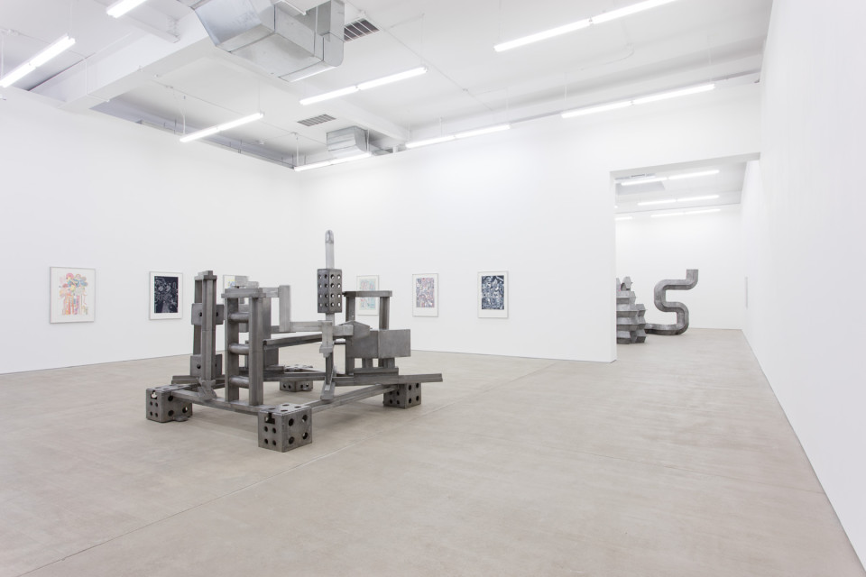
John Goodyear, Blue and Brown Kinetic Construction, 1964, acrylic on wood and canvas, 24 x 24 x 5 inches (Berry Campbell Gallery, New York).
The optic-kinetic constructions John Goodyear was making in the mid-1960s registered quickly on the contemporary art radar screen. In 1965 alone his work was included in The Responsive Eyeat New York’s Museum of Modern Art, Art in Science at the Albany Institute of History and Art, and Kinetic and Optic Art Today at the Albright-Knox Gallery in Buffalo. With visual dazzle on the one hand and technological know-how on the other, Op and Kinetic exhibitions promised ever-expanding horizons for artistic expression, while in the discourse surrounding them – in images, for instance, of research teams at work, not in studios but in laboratories – impersonal objectivity hovered as a guarantee of the new art’s authenticity. And thus was rehearsed a periodically recurring theme in 20th Century art, namely, its urge to secure credibility by grafting onto itself the methods and procedures and look of science. But science was neither the source nor the goal for Goodyear’s art, nor was credibility ever an issue, not then, and not now. His kinetic effects, for one, required no technology to speak of, just the touch of a finger, the tilt of a head, even a casual walk-by; while, secondly, whatever the resulting visual dazzle, it was just a prelude to the meditations that followed – about how and where real and virtual space connect, about images coming and going and being at once here and there, about paradox and ambiguity, about chance, about indeterminacy. If there was a model for such an art, its locus was not in the lab but in and around the ways of Cage or Duchamp.
John Goodyear, Red, Yellow, Blue Construction, 1978, acrylic on wood and canvas, 28 3/4 x 29 1/4 x 6 inches.
It goes without saying that John Goodyear’s art possesses a way of its own, a way I would describe as modest and unassuming, a way accessible in regularly referencing everyday experience, a way gently prodding thought while also being quietly informed by humor, a way generous in the openness and ease of its invitation to participate in its sensory and cerebral pleasures – as easy and accessible and natural, for instance, as looking out a third-floor window and all at once seeing the art in the tiled plaza you walked across but unknowingly missed because you were preoccupied with the quotidian business of meeting your appointment at the University of Medicine and Dentistry in Piscataway, New Jersey. John Goodyear’s way not so much makes art as allows art to happen, as if art were somehow there all along, as if latent, awaiting activation. Within the rhythm of this way, art experience and lived experience intersect and are continuous with one another by virtue of constantly informing one another. Within their interaction, at the same time, they are not the same, not interchangeable, for the identity of each – its viability in doing what it does and meaning what it means – is ever grounded in an acknowledgment of the separateness of the other, a separateness in which they are finally bound. Such, for me, is the way of John Goodyear’s art.
John Goodyear, Food for Thought, 2011, acrylic on wood and canvas, 96 x 39 x 6 inches.
John Goodyear, The Indicative, 2013, acrylic on wood and canvas, 24 x 27 x 2 1/2 inches (Berry Campbell Gallery, New York).
John Goodyear, Women of Art, 2014, acrylic on wood and canvas, 72 x 36 x 3 inches (Berry Campbell Gallery, New York).
John Goodyear, Figurative Abstraction, 2015, acrylic on wood and canvas, 36 x 36 x 6 inches (Berry Campbell Gallery, New York).
There is little I can add to Roberta Smith's enthusiastic review of Frank Stella: A Retrospectiveat the Whitney Museum of American Art (through Feb. 7th), and there are many good reproductions of the work on the Whitney's website. What I can do here is provide some additional installation views of the exhibition so that you can get an idea of the tremendous scale of this extravagant, innovative, outrageous, sometimes completely bonkers art. I also provide some close-up views to show the variety of textures and layers.
Paintings from 1958-59, the earliest work in the exhibition.
Panoramic installation view of Stella's earlier work. Click to enlarge.
Stella uses colors arbitrarily, to distinguish one shape from another. His colors don't resonate, interact or harmonize the way, say, Matisse's colors do. But that's asking Stella to be something he is not.
Frank Stella, Damascus Gate (Stretch Variation III), 1970. alkyd on canvas, 120 × 600 inches (The Museum of Fine Arts, Houston; museum purchase funded by Alice Pratt Brown).
The Whitney's walls are not curved; this distortion typically happens with panoramic images.
Panoramic installation view of work from Stella's middle periods. Click to enlarge.
St. Michael's Counterguard, 1984, mixed media on aluminum and fiberglass honeycomb, 156 x 135 x 108 inches (Los Angeles County Museum of Art).
Close-up side view ofSt. Michael's Counterguard, 1984.
On the left, Raft of the Medusa (Part I), 1990, aluminum and steel, 167 × 163 × 159 inches (The Glass House, A Site of the National Trust for Historic Preservation).
Close-up detail, Raft of the Medusa (Part I), 1990.
In Stella's later work, he employs bright color, vigorous brushwork, and rhythmic line to enliven things; often these paintings are so active and aggressive they feel like an attack. The later work is very public, i.e., not intimate; it's meant for large public spaces like corporate lobbies or museums – abstract Pop Art, if you will. It's just that seeing a lot of them together is exhausting.
The reproduction below is of a huge, sixty-seven color print!
The Fountain, 1992, woodcut, etching, aquatint, drypoint, collage and airbrush, (printed and published by Tyler Graphics, Ltd., Whitney Museum of American Art).
I've known John for at least forty years, but I don't love his art just because we're friends. As with Charles Garabedian, I loved John's art, so I made it a point to get to know him, then we became friends.
An exhibition of his relatively recent paintings and drawings can be seen at the Betty Cuningham Gallery, 15 Rivington Street, Lower East Side (through November 28th). I say "relatively recent" because John will work on a painting or drawing for years, decades sometimes – Man Sitting in an Armchair, for example, is dated 2008–2015.
Man Sitting in an Armchair, 2008-2015, oil on canvas, 42 x 36 inches.
He builds up the paint, scrapes it off, sands it down, and works into it again and again, piling up the paint so much that it becomes a palpable physical presence. The result is a crusty, fragmented image embedded in the rough, craggy paint surface.
Side view of Man Sitting in an Armchair, 2008-2015.
Memory is frequently the subject of John's art, or, more accurately, he paints the experience of remembering. Man Sitting in an Armchair, for example, is a memory of his father; and, like a memory, the images are fleeting and hazy, slowly coalescing to reveal more and more detail the longer you stay with it.
Detail of the lower left of Man Sitting in an Armchair, 2008-2015.
Lees's drawings are particularly remarkable because one doesn't expect this much physicality in a drawing.
In the Park/Early Morning, 2009-15, graphite, ink on paper, 11 x 9 ⅛ inches.
His drawings are worked and re-worked, erased until threadbare, patched and worked again. And like the paintings, the drawings are physically part of the paper the way the images in his paintings are physically part of the paint.
You can see this better in this photo of a drawing from an earlier exhibition:
River Landscape (For Bas Jan Ader), 2003; 2005-2007; 2009, ink, conte, sanguine, chalk and gouache on paper, 25 3/4 x 43 1/2 inches.
John is a good old-fashioned painter's painter, and very much a man of the 1930s and 40s, even though he wasn't even born until 1943. He enthusiastically talks about books, music, movies, and other things that happened then as if they were yesterday. So it's not surprising that the show contains several drawings and paintings with the words "42nd Street," referring to the 1933 movie directed by Lloyd Bacon.
42nd Streeet (Tesserae), 2015, oil on canvas, 24 x 32inches.
Behind the words "42nd Street," or, more accurately, superimposed on a grid embedded into the words, is dialogue from the movie in which an old actress gives over her starring role to a young actress. The painting encapsulates the movie and these words as if it's the physical embodiment of them.
Detail: 42nd Streeet (Tesserae), 2015.
This is a fabulous show – one of the rare exhibitions of art that evokes meaning in a powerfully visceral way.
Here are highlights from the 19 Bushwick galleries I went to last week. I tried to get at least one good photo of each; a closeup detail, if I thought it might be useful; and an installation view to give you a sense of the scale of the art. Most of the gallery websites have additional images and information about the art.
Since there are 63 Bushwick and Ridgewood galleries listed on the excellent and comprehensive BushwickGalleries.com, this roundup is far from complete. More highlights will follow soon.
SOHO20, 56 Bogart, Ann Young Water:Color, and Kathy Stark In Plain Sight (through November 9th). This gallery is new to Bushwick, but it has been around since 1973. They focus on women artists.
Installation view of Ann Young's exhibition, Water:Color.
Ann Young, Water Shield # 131, 2014. oil on canvas, 20 x 20 inches.
Installation view of Kathy Stark's exhibition, In Plain Sight.
Detail, Kathy Stark, Tossed in Unpredictable Directions by Random Events, 2015, mixed media on wood.
Theodore:Art,56 Bogart, Ready for Mayhem: Scooter LaForge and Bill Mutter (through December 6th). This is a two-person show, but the work goes so well together I originally thought it was a collaboration.
Installation view of Scooter LaForge and Bill Mutter's exhibition Ready for Mayhem.
Bill Mutter, Little Frog Doll, 2014, glazed earthenware and lace, 6 x 9 x10 inches.
Scooter laForge, Raggedy Ann and Andy Go To School, 2015, mixed media, artist frame, 48 x 36 inches.
Life on Mars, 56 Bogart, Todd Bienvenu, Exile on Bogart Street (through November 8th).
Installation view of Todd Bienvenu's exhibition Exile on Bogart Street.
Todd Bienvenu, Wrestlemania, 2015, oil on canvas, 84 by 96 inches.
Studio 10, 56 Bogart, Meg Hitchcock, VERBATIM (through December 20th). Hitchcock laboriously cuts out letters from a sacred text and uses them to make a design and another text.
Installation view of Meg Hitchcock's exhibition VERBATIM.
Meg Hitchcock, Paradise, 2015, letters cut from the Koran, approximately 12 inches high.
Close-up detail of Meg Hitchcock, Paradise, 2015.
Robert Henry, 56 Bogart, Elise Engler: A Year on Broadway (through December 20th). Using gouache, watercolor and colored pencils, Elise Engler spent a year documenting every block of Broadway – all 13 miles of it.
CLEARING, 396 Johnson Avenue, Eduardo Paolozzi, Horizon of Expectations (ended October 31st). Eduardo Paolozzi, who died in 2005, was a British artist active in the second half of the twentieth century. He will have a major retrospective in 2016, organized by the Whitechapel Gallery, London.
Installation view of Eduardo Paolozzi, Horizon of Expectations. In the foreground is the sculpture Kalasan, 1973-1974, cast, extruded and welded aluminum, 82 3/4 x 85 1/2 x 102 3/4 inches.
Foreground: Trishula, 1966, cast, extruded and welded aluminum, 74 x 78 x 112 1/2 inches; background: Suwasa, 1966, cast, extruded and welded aluminum, 87 1/2 x 37 1/2 x 130 3/4 inches.
Odetta, 229 Cook Street, Seeing Sound, work by Jane Harris, Alex Paik and Gelah Penn (through November 1st). The work I liked most in this three-person exhibition was by Alex Paik. The colored reflections off the ribbons of paper create a hazy atmospheric perspective that results in a sense of depth.
Alex Paik, Modular Wall Installation, 2015, gouache, colored pencil, paper and nails, 96 x 180 x 1 1/2 inches.
Detail, Alex Paik, Modular Wall Installation, 2015.
Microscope, 1329 Willoughby Avenue, Sarah Halpern, The Changing Room (through November 29th).
Sarah Halpern, Traces, 2015, glue, pencil, and collage on paper, 12 x 12 inches.
Sarah Halpern, Chapters, 2015, 16mm film, single-channel video, and laptop.
Halpern's video/film installation is multi-layered. A 2 ½ minute hand-processed color film of pages from the 1958 novel The Leopard by Giuseppe Tomasi di Lampedusa, and footage from the 1963 movie of the same name directed by Luchino Visconti, are projected onto a laptop screen on which a video of the famous 45-minute ballroom scene is playing.
There were three excellent group exhibitions that involved many artists, and all of them were in small spaces.
Transmitter, 1329 Willoughby Avenue, Painting: More or Less... with works by Aimée Terburg, Alain Biltereyst, Chris Fennell, Danielle Mysliwiec, Emma Langridge, Michael Rouillard, and Shawn Stipling. The subject of this group exhibition was the variety of mark-making possibilities.
On the left: four small works by Emma Langridge; on the right: Chris Fennell, Enkidu, mixed media on canvas, 48 x 40 inches.
Emma Langridge, B1, 2015, enamel and acrylic on wood, 11 ⅞ x 11 ⅞ inches.
TSA New York, 1329 Willoughby Avenue, American Pharoahs curated by William Crump, including Mariah Dekkenga, Robbie McDonald and Ian Pedigo (through December 6th). Like this year’s Triple Crown winner, American Pharoahs, these artists are triple threats, and work in at least three disciplines including painting, sculpture, performance, collage, photography, installation, and digital media.
From the left: ink drawings on rice paper by Mariah Dekkenga; Robbie McDonald, Sad Blue Flowers, 2015, wood, acrylic, bulbs and wire; and in the background, on a shelf: Mariah Dekkenga, Untitled no. 3, 2015, sand and plaster.
Underdonk, PAUL KLEE (through November 1st). This is an exhibition of relatively small work by twenty artists who have some affinity to Paul Klee. Some of the artists are well know, such as Brenda Goodman, Jonathan Lasker, Dona Nelson, Carl Ostendarp (who really didn't fit), and my favorite ceramic artist, Joyce Robins.
From the left, work by Lori Ellison, Brenda Goodman, Glenn Goldberg, Sanford Wurmfeld, Peter Acheson and J. Grabowski.